Maybe you’ve seen it.. maybe you’ve heard of it.. it’s responsive website design. This is the next greatest thing in the world of web design. In a world where technology is growing and the number of devices we own is rising, website accessibility across multiple devices is one of the most important elements of a website. Hello, responsive website design: the one design that works on all devices.
Say goodbye to designing a separate mobile site. Say goodbye to your website not quite working on tablets. Say goodbye to people ragequitting your site because it doesn’t accommodate mobile devices. Responsive web design does it all.
So what is it exactly? Responsive web design is a way of designing your website using percentage-based widths/margins and CSS media queries to make your website change and adapt to accommodate any size resolution.
If you design a normal website for a desktop computer, you likely have fixed widths. You decide you want your website to accommodate a 1024px width and work from there. But what happens when you view that same website on a smartphone? The entire website scales down to fit the much smaller screen and in order to read and navigate through the website, the user has to zoom in and then move both vertically and horizontally. Responsive design, on the other hand, completely removes horizontal scrolling.
Instead of just zooming out your website, forcing you to zoom back in to read it, responsive design changes the layout to fit the new resolution. You can even open up the website in your browser, resize the browser window, and watch the layout change and adapt to fit the new window sizes with zero horizontal scroll bars!
I recently created my first responsive website, Nose Graze. Let’s take a look at how the site design changes according to your screen resolution:
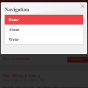
Check out the differences! On the desktop version you have the site logo, a “normal” navigation and search bar at the top, images for each blog post, and a sidebar on the right. But when the resolution gets to tablet-size and below, the layout changes significantly. The logo is gone and we only see the site name, the navigation and search bar have both been replaced by buttons (which, when clicked, open a JavaScript menu), the images for the blog posts are gone, and the sidebar has disappeared (what you can’t see in the image is that the sidebar now appears below the main content – after the blog posts). The tablet and mobile versions of the site are much more simplistic. The last image shows what the navigation JavaScript popup looks like.
It was my first experience with responsive design so the first thing I did was research frameworks to get me started. I stumbled across the ZURB Foundation Framework. It essentially works like you’d expect any web design column grid to work (such as the 960 Grid System), but with a few differences. As you can see from the grid section of the documentation, Foundation works off of a 12 column system. You can specify the maximum width you want your website to be displayed in, and then put all of your website elements into different size columns. The columns are based on a percentage, so their sizes will grow or expand as you change the screen resolution. But the CSS media queries are set up so that once you go below a certain resolution, all of the columns expand to the full width of the device. This is key to prevent any horizontal scrolling (or extremely small columns).
Another fantastic feature is the layout feature. Sometimes collapsing elements simply doesn’t cut it. Maybe you want certain images to be hidden on mobile devices or only appear on tablets. Easily done! Foundation has an excellent system where you can simply add one of six classes to a tag. As an example:
<strong class="show-on-desktops">You are on a desktop machine.</strong>
<strong class="show-on-tablets">You are on a tablet device.</strong>
<strong class="show-on-phones">You are on a smartphone like an iPhone or Android phone.</strong>
<strong class="hide-on-desktops">You are not on a desktop machine.</strong>
<strong class="hide-on-tablets">You are not on a tablet device.</strong>
<strong class="hide-on-phones">You are not on a smartphone like an iPhone or Android phone.</strong>
Awesome, right?
So on the Nose Graze website I had two different navigations. On the desktop site I had the ‘normal’ navigation at the top with three different links and a search bar to the right. That search bar had the class “hide-on-phones” applied to it. I then created a separate navigation and search bar triggered by buttons. Those two buttons had the classes “show-on-phones” applied.
I have completely fallen in love with responsive web design. I will absolutely be using a responsive design framework for all of my future websites, and I highly recommend Foundation (but feel free to share other options!). If you’re into crazy, out of the box, creative designs, using a responsive framework may make things challenging or limit your creative possibilities. But for most websites, there are no downsides. This design will make your website accessible across all devices and resolutions. Don’t make browsing your website on a smartphone a huge headache. Take a look at your website statistics to find out just how many people are browsing your site on a smartphone. Would your traffic increase if you had a great mobile site? Probably.
Go responsive!


